
A research cycle has many phases. Toward the end of the data collection period–when some of the preliminary findings become more clear–you need to start thinking about how you are going to analyze the findings and create the narratives to support them. In this section, you will find suggestions on how to approach this phase, along with some specific examples based on our experience.
What you’ll find
At this stage, you are able to see the final results. If you worked on multiple companies and/or services, you have the final company rankings and a good sense of the overall results. As a first step, you should revisit your original advocacy plan and remind your group of the goal you set to achieve.
Ideally, you identified a few questions you wanted to answer at the beginning of your project. If you need to, you can go back and review the Prepare section. When analyzing the data, your goal is to be able to use it to answer those questions. To do this, we suggest looking at your dataset from a bird’s-eye view. For this, you can use the most basic data view that RDR also provides in the form of its final data set (this a direct download to the .xls file of the full 2020 RDR Index data). Based on this high-level view, you should be able to answer a few big broad questions:
By looking for the big picture within your findings, you will be able to identify more specific questions that the dataset will help you answer. Once you have those questions, you can identify and create additional dataviews for them, for example, why Company X is performing better in certain areas than Company Y. If you would like an external perspective, feel free to contact us at partnerships@rankingdigitalrights.org !
While you are examining the dataset, you should also look into obtaining more background information on the issue areas and companies you cover. At RDR, we approach this by preparing backgrounders for each company and conducting jurisdictional research about the local policies and regulations (in the Prepare section you’ll find more information about the jurisdictional surveys and a template to download for your own use). Having these backgrounders can be very helpful in outlining the stories that you would like to tell about the companies.
What information does the backgrounders usually include? Here’s a non-exhaustive list:
Depending on your advocacy goal, decide what outputs you are going to publish and how you want to publish them. At RDR, our main outputs are company-specific reports, which are usually 2-3 pages long, and then a longer “key findings” essay that summarizes the findings across all companies. However, this might be very different if you are targeting lawmakers or if your primary goal is to raise awareness among the public about a specific issue.
Our work involves targeting diverse stakeholders, so besides our main publications mentioned above, we create specific outputs for each stakeholder, which allows us to be more effective in getting our message across. We produce policy recommendations for companies and governments, we provide insight from our findings to companies’ shareholders and the broader investor community, and we also work with other civil society organizations to amplify our recommendations to companies. In the Apply section, you will learn more about our joint work with other organizations, such as our letters campaign with Access Now.
When drafting outputs, we suggest using storytelling as a writing principle. We need to tell stories because stories help generate change. Before sitting at a desk to write, there are some questions worth answering about the goal of the outputs. What information does the backgrounders usually include?
Here’s a non-exhaustive list with some ideas:
In order to achieve greater impact with your work, stories can help demonstrate the importance of your findings. By applying storytelling as an approach, you will become “conversant” with your stakeholders and build your own voice.
It is also important to tie your outputs to discrete goals and measures of impact. To achieve this, we suggest creating every written output with realistic, defined goals in mind. We also suggest identifying a specific audience for each output, and tying your goals to this audience.
When thinking about what you want to achieve as a result of the project, it’s useful to reflect on the big picture and where the project fits, both in terms of the sociopolitical context as well as the digital rights landscape.
Though these suggestions have been helpful for RDR’s work, each research project is unique and therefore requires its own custom plan.
Once you have completed the data collection process, assigning scores to the individual elements within each indicator, you are ready to use the scores summary sheet, created with the data management toolkit. The scores summary sheet provides a bird’s eye view that allows you to keep track of the scores for all the companies and services across every indicator in your project.
After completing Step 1 of the research process, the Scores Summary should look similar to the table below:
If you recall from the research design section of the Prepare page, for each element in an indicator that you evaluate, a score is assigned to each answer: 100 points for a “Yes/full disclosure”, 50 points for a “Partial,” and 0 points for a “No” or “No disclosure found.” The role of the scores summary sheet is to display the final scores, calculating the averages from all the elements in each indicator. With these scores you can now focus on creating graphics and charts to illustrate the findings.
To kick-off this process, there are some questions that can help you choose an appropriate course of action:
Sometimes it’s tricky to know from the outset what are the aspects from the research that you want to highlight for the narrative side, especially when looking solely at numbers on a spreadsheet, so go ahead and experiment with different visualizations.
There’s a myriad of tools online that you can use to create graphics, some offer both free and paid versions, some are more technical and with a steeper learning curve than others.
Here are some suggestions to help you get started:
[table id=8 /]
For the purposes of this tutorial we’ll use Flourish, given that they provide a free plan with all the features you need to create your first data visualizations.
We’re going to use the example scores from the table above. We have prepared a test score summary sheet for you that you can download and import in your preferred tool to play around and create test charts to see what works for you.
After creating an account in Flourish, from the home page you’ll click on the “New visualization” button, which will then take you to the templates page where you can select the type of graphic that fits with the objectives you set at the beginning of this process.

As you can see from our rankings, we mostly rely on bar charts to illustrate our research findings, primarily because they are a way of showcasing data with less bias when measuring points on a scale from 0 to 100, and they also make comparisons between indicators, companies, and services easier.
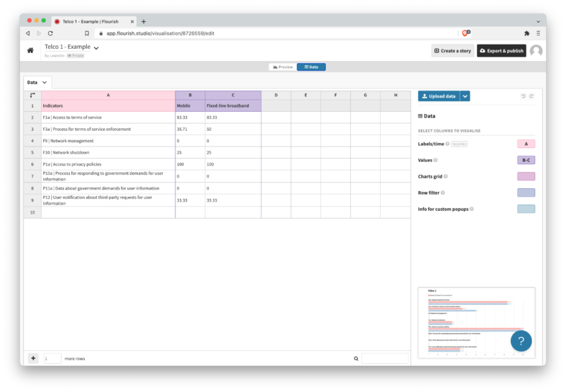
The next step is to import and clean the data, which you can do directly in the “Data” section, either manually copying and pasting the information from your Score Summary sheet, or uploading the file directly. Cleaning up the data means customizing the specific columns and rows to fit with whatever information you want to visualize. In the example below, you’ll see that we assigned column A to the indicators, and columns B and C to the scores for the specific services of the company.
In the “Preview” section you’ll be able to customize the look and feel of the chart. The most important aspect before working on the design aspects, like the color scheme and labels, is to set the specific scale in the X axis, to ensure that the bars follow a cohesive proportion according to the scores from a minimum of 0 to 100 max.
Once you’re happy with the design, you can export the chart and download it in an image format that you can use to incorporate it in a PDF, a website or share on social media. There’s also an option to publish the chart directly on Flourish, so you can share a link or embed the chart on a website, which can be useful if you use dynamic elements such as hover labels or animations.

